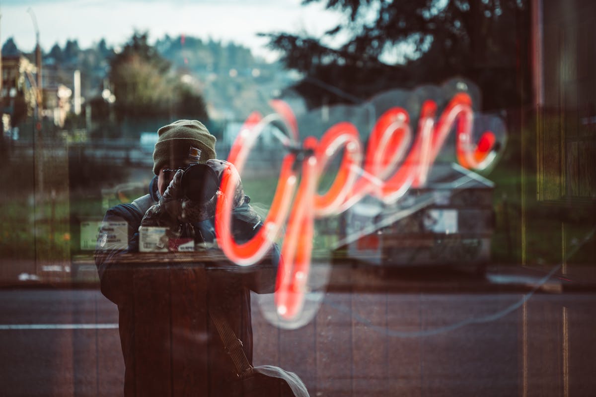
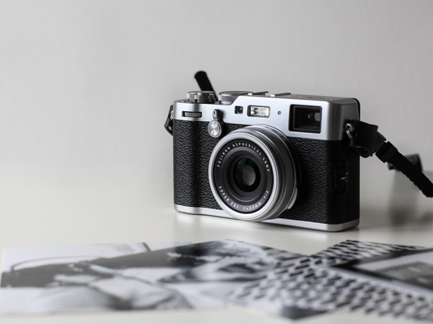
Color is one of the most powerful tools in photography. It has the ability to evoke emotions, set the mood, and guide the viewer’s eye. Understanding the psychology of color and how to use it effectively can transform your photography, allowing you to tell compelling stories with just a single image. Whether you’re capturing a vibrant landscape, a moody portrait, or a minimalist still life, the colors you choose and how you use them can significantly impact the narrative of your photo.
In this article, we’ll explore the psychology of color in photography and offer tips on how to use color to enhance your storytelling.
1. The Basics of Color Psychology
Color psychology is the study of how colors affect human behavior and emotions. Different colors can evoke different feelings, associations, and reactions. For example, red is often associated with passion, energy, and urgency, while blue is seen as calming, trustworthy, and serene. By understanding these associations, photographers can use color to influence how their images are perceived.
Here’s a quick overview of some common color associations:
- Red: Passion, energy, love, danger, excitement
- Blue: Calmness, trust, sadness, peace, reliability
- Yellow: Happiness, optimism, warmth, caution, creativity
- Green: Nature, growth, harmony, health, envy
- Orange: Enthusiasm, warmth, creativity, playfulness
- Purple: Luxury, mystery, spirituality, creativity
- Black: Power, elegance, mystery, death, sophistication
- White: Purity, simplicity, cleanliness, peace, innocence
These are general associations and can vary based on cultural context and personal experiences. As a photographer, you can use these color associations to enhance the story you’re telling through your images.
2. Using Color to Set the Mood
The mood of a photograph is largely influenced by its color palette. Warm colors like red, orange, and yellow tend to evoke feelings of warmth, comfort, and energy, making them ideal for creating a lively or inviting atmosphere. Cool colors like blue, green, and purple, on the other hand, are more calming and can be used to create a serene or contemplative mood.
For example, a photo of a sunset with rich oranges and reds can convey a sense of warmth and romance, while a landscape photo dominated by blues and greens can evoke tranquility and peace. Understanding how different colors affect mood allows you to choose a color palette that aligns with the story you want to tell.
3. Color Harmony and Contrast
Color harmony and contrast are essential concepts in using color effectively in photography. Color harmony refers to the pleasing combination of colors, while contrast involves the use of opposing colors to create visual interest.
Color Harmony
Harmonious colors are those that are next to each other on the color wheel, such as blue and green or red and orange. These combinations create a sense of balance and can be soothing to the eye. They’re often used in images where the goal is to create a sense of calm and unity.
Color Contrast
Contrast is achieved by using colors that are opposite each other on the color wheel, such as blue and orange or red and green. High-contrast color combinations can make an image more dynamic and draw attention to specific elements within the frame. This technique is particularly effective in guiding the viewer’s eye to the focal point of the photo.
For instance, a portrait where the subject is dressed in red against a green background can make the subject stand out, creating a powerful and striking image.
4. Using Color to Tell a Story
Every photograph tells a story, and color is a key element in how that story is conveyed. By carefully choosing and manipulating colors, you can enhance the narrative and create a deeper emotional connection with the viewer.
Color as a Narrative Device
Incorporating color as a narrative device involves using colors to symbolize certain themes or emotions within your story. For example, you might use muted colors to convey a sense of nostalgia, or bright, saturated colors to depict joy and excitement.
Consider how color can be used to represent characters or themes in your photography. For example, in a series of images depicting a journey, you might use warm colors at the beginning to symbolize optimism and adventure, gradually shifting to cooler tones to convey the challenges and introspection encountered along the way.
Creating a Color Story
A color story is a consistent use of certain colors throughout a series of images that ties them together thematically. This technique is often used in editorial photography, where the colors in each image are carefully curated to create a cohesive narrative.
For example, in a photo series for a fashion shoot, the use of pastels might convey a sense of springtime renewal and freshness. By maintaining a consistent color palette, you can create a visual narrative that resonates with the viewer and reinforces the story you’re telling.
5. Practical Tips for Using Color in Photography
Pay Attention to Color Relationships
When composing your shot, consider the relationships between the colors in the scene. Look for complementary colors that enhance each other, or analogous colors that create harmony. Be mindful of how different colors interact and how they affect the overall mood and composition of the image.
Use Color to Create Depth
Color can be a powerful tool for creating depth in your photos. Warm colors tend to come forward, while cool colors recede, creating a sense of three-dimensionality in your images. By placing warm colors in the foreground and cool colors in the background, you can enhance the perception of depth and draw the viewer’s eye into the scene.
Experiment with Monochromatic Color Schemes
A monochromatic color scheme involves using different shades, tints, and tones of a single color. This approach can create a strong visual impact and is particularly effective in creating a mood or emphasizing a specific theme. For example, a monochromatic blue palette can evoke a sense of calm and introspection, while a monochromatic red palette might convey intensity and passion.
Incorporate Color in a Photo Booth Setup
If you’re setting up a photo booth for an event, consider how you can use color to enhance the experience. You might choose a vibrant backdrop that complements the colors worn by guests, or provide props in contrasting colors to add visual interest. By thoughtfully incorporating color into your photo booth setup, you can create a fun and visually appealing environment that encourages guests to engage with the camera and capture memorable photos with buy a roaming photo booth.
Conclusion
The psychology of color is a fascinating and powerful aspect of photography that can significantly enhance your storytelling. By understanding how different colors affect mood, emotion, and perception, you can use color to create images that resonate with viewers on a deeper level.
Whether you’re using bold, contrasting colors to create drama or soft, harmonious hues to evoke tranquility, the way you use color can transform an ordinary photograph into a compelling visual narrative. So next time you’re composing a shot, take a moment to consider the colors in your frame—how they interact, what they convey, and how they contribute to the story you’re telling.


